Brand & Digital Design
My Role
Brand identity system (2021),
UX and web design (2022–23)
Project Type
Project Based
Duration
2021 & 2022–23
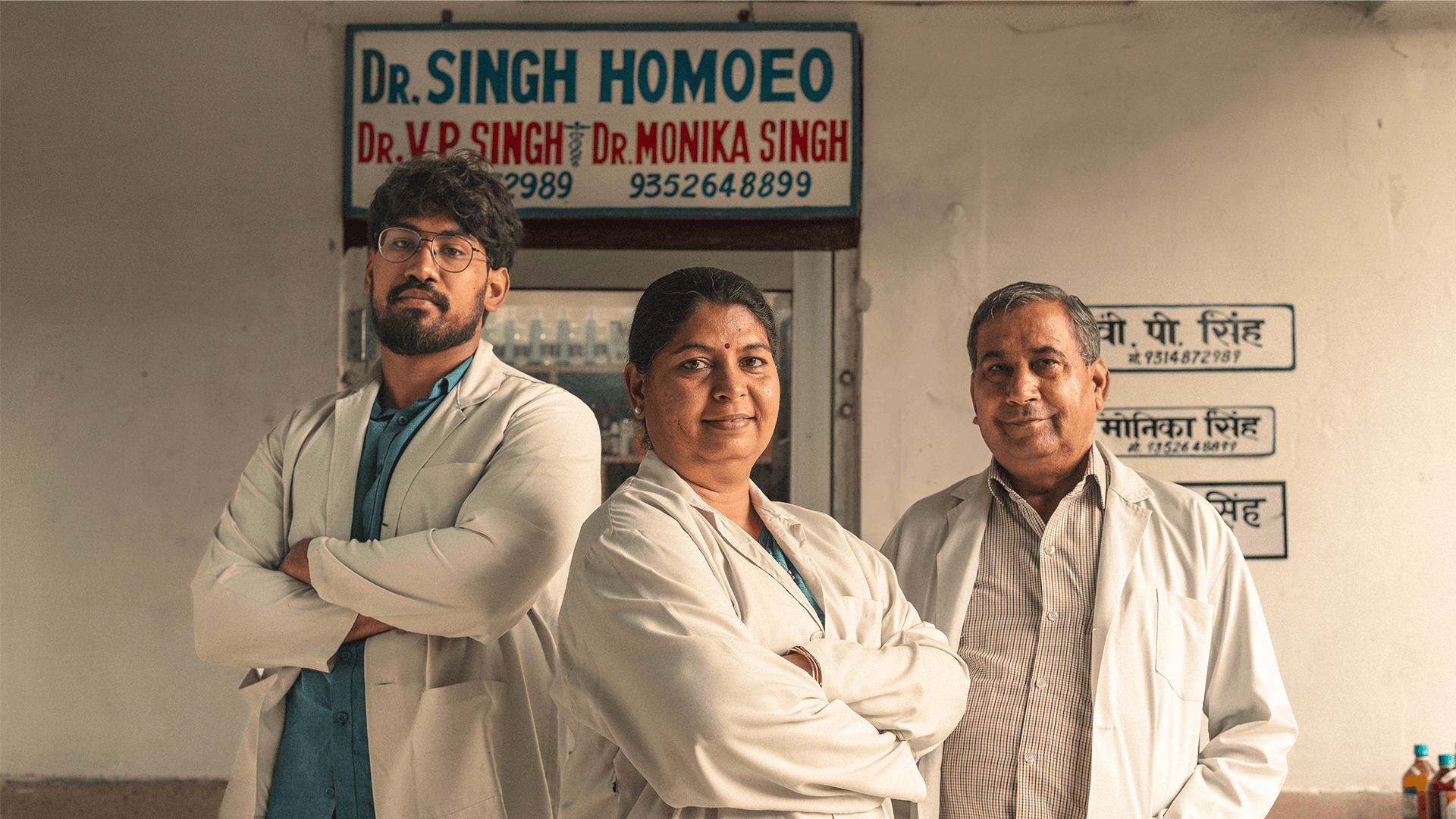
Dr. Singh Homoeo is a homeopathic clinic with over 35 years of practice, built on a philosophy of compassionate care, where treating the person always mattered as much as treating the illness. A clinic of this legacy had earned deep patient trust over decades. The challenge was to carry that trust forward into a modern visual identity and eventually a digital presence, without stripping away the warmth and familiarity that made it what it is. Two separate engagements. One continuous idea.
The core tension in both projects was the same: how do you modernise something without making it unrecognisable? Legacy institutions carry weight that a fresh rebrand can accidentally erase. The answer wasn't to make it look new. It was to make it look like itself, but clearer.
For the brand, that meant anchoring the identity in what people already associate with homeopathy, familiar enough to foster trust instantly, considered enough to feel like a real brand. For the website, it meant designing against the noise; most medical websites overwhelm. This one had to feel like the clinic itself: calm, accessible, and trustworthy.

Brand Identity: 2021
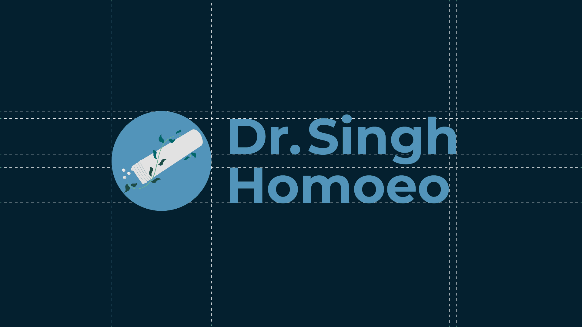
The monogram became the heart of the identity. A homeopathic bottle with sugar pills floating outward is the image most deeply associated with homeopathy in the public imagination. Flanking it, wave-like stems with leaves evoking growth, vitality, and nature. Iconic without being generic. Familiar without being plain. The full system logo, palette, typography, and style guide were built to carry decades of trust into a mark that could finally represent it visually.

Website: 2022–23
A competitive audit of similar medical platforms revealed a consistent problem: cluttered layouts, confusing navigation, and information that felt like advertising rather than care. Homeopathic clinics, in particular, had no established design standards; most looked like they were trying too hard to sell something. This website was designed to feel like the opposite. Clean information hierarchy, intuitive navigation, and a tone that extended the clinic's warmth into the digital space.
There's something particular about designing for a legacy. You're not starting from zero; you're inheriting decades of meaning and trying to give it a shape it never had before. Both projects were about that same act of translation: taking something that existed in people's trust and experience, and making it visible. Getting that right, without losing what made it real, was the most important design challenge in both.

View More


