Re-branding Brand Guidelines
Re-branding Brand Guidelines
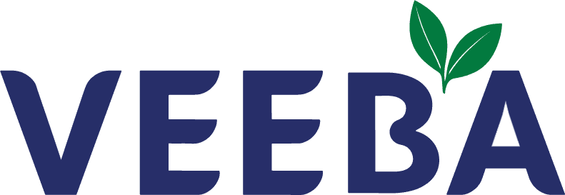
Food is not just sustenance—it’s a deeply emotional experience. The colors, designs, and branding of food products play a powerful role in sparking cravings and building connections. When I looked at Veeba’s logo, I realized it didn’t align with the vibrant emotions their brand evokes. It felt detached from their vision and disconnected from their broader branding language.
Food is not just sustenance—it’s a deeply emotional experience. The colors, designs, and branding of food products play a powerful role in sparking cravings and building connections. When I looked at Veeba’s logo, I realized it didn’t align with the vibrant emotions their brand evokes. It felt detached from their vision and disconnected from their broader branding language.
This project was about closing that gap and creating a logo that doesn’t just represent the brand but becomes a part of the emotional journey food inspires. To redesign Veeba’s logo in a way that brings it in harmony with the brand’s essence. The aim was to craft a logo that reflects the emotional bond their products create while integrating seamlessly with their existing visual identity.
This project was about closing that gap and creating a logo that doesn’t just represent the brand but becomes a part of the emotional journey food inspires. To redesign Veeba’s logo in a way that brings it in harmony with the brand’s essence. The aim was to craft a logo that reflects the emotional bond their products create while integrating seamlessly with their existing visual identity.
My Role
My Role
Logo Design, Brand book creation
Logo Design, Brand book creation
Tools
Tools
Adobe Illustrator
Adobe Photoshop
Adobe Illustrator
Adobe Photoshop
Duration
Duration
Feb - June 2023 (5 month)
Feb - June 2023 (5 month)

Heuristic Analysis
Heuristic Analysis
Sense of Seriousness
Veeba wants to identify as fun & playful and tries it with its packaging graphics yet the logo forms just the opposite emotion.
Veeba wants to identify as fun & playful and tries it with its packaging graphics yet the logo forms just the opposite emotion.
Color & Meaning
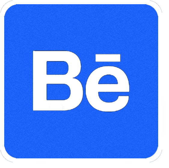
Relates to something associated with pharmacy, also does not fit well with their other brand assets.
Relates to something associated with pharmacy, also does not fit well with their other brand assets.
Survey Study
The survey analysis revealed a disconnect between Veeba's branding and user perceptions. Respondents frequently described the brand's visuals as "generic," "boring," and "childish," with packaging failing to resonate with Veeba's values or identity. This aligned with findings from the heuristic analysis, which highlighted that the logo and packaging lacked innovation and emotional appeal, failing to communicate the brand's essence effectively.
The survey analysis revealed a disconnect between Veeba's branding and user perceptions. Respondents frequently described the brand's visuals as "generic," "boring," and "childish," with packaging failing to resonate with Veeba's values or identity. This aligned with findings from the heuristic analysis, which highlighted that the logo and packaging lacked innovation and emotional appeal, failing to communicate the brand's essence effectively.
Competitive Analysis
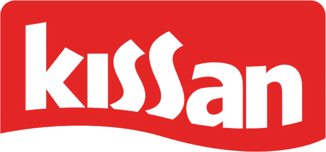
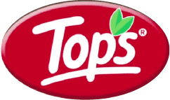
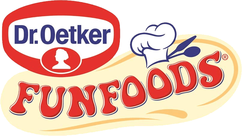
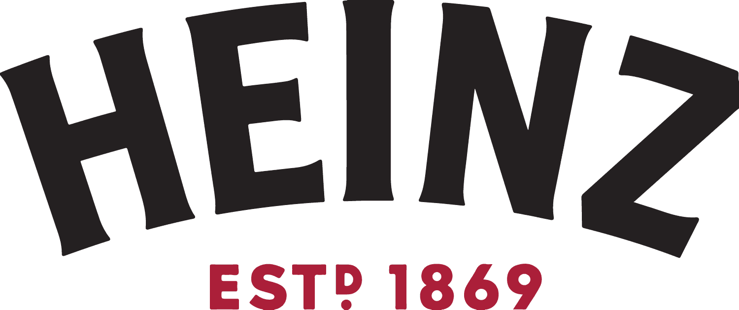
Going through the other brands when trying to understand how the new brand identity of veeba would work. I looked closely and found out that Veeba logo matched “tops” brand too much. Veeba Foods faces tough competition from industry giants like Heinz, Kissan, and FunFoods. These established brands have a strong presence in the market and offer a wide range of food products.
Going through the other brands when trying to understand how the new brand identity of veeba would work. I looked closely and found out that Veeba logo matched “tops” brand too much. Veeba Foods faces tough competition from industry giants like Heinz, Kissan, and FunFoods. These established brands have a strong presence in the market and offer a wide range of food products.
Process
Process
ABCDEFG1234
ABCDEFG123
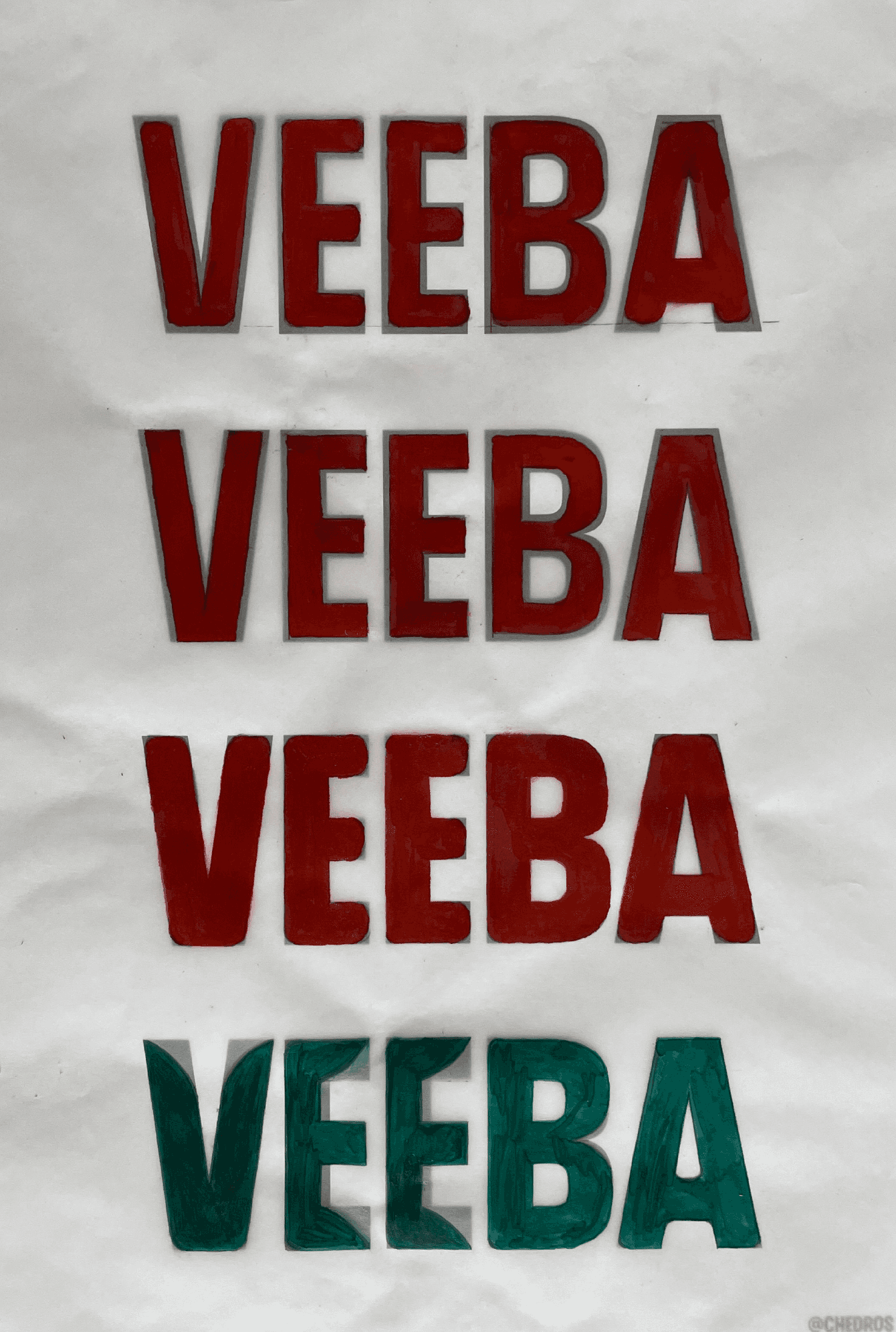
In the pursuit of creating a distinctive and meaningful brand identity for Veeba Foods, I made a deliberate choice to explore a different core typeface instead of relying on the commonly used Myriad. After going over a lot of fonts i chose Chedros Typeface to work further on, as it has High Cap Height: Boldness, Confidence, Elegance and sophistication, Modern and playful design.
In the pursuit of creating a distinctive and meaningful brand identity for Veeba Foods, I made a deliberate choice to explore a different core typeface instead of relying on the commonly used Myriad. After going over a lot of fonts i chose Chedros Typeface to work further on, as it has High Cap Height: Boldness, Confidence, Elegance and sophistication, Modern and playful design.
Logo Font
Simplyfying
Myraid Typeface


During the process of decoding the Veeba logo, I discovered that its core form was derived from the Myriad typeface, which had modified. This choice, though functional, didn’t align with the brand’s identity. This insight underscored the need to reimagine the logo starting from the foundational typeface to better reflect the brand’s essence and values.
During the process of decoding the Veeba logo, I discovered that its core form was derived from the Myriad typeface, which had modified. This choice, though functional, didn’t align with the brand’s identity. This insight underscored the need to reimagine the logo starting from the foundational typeface to better reflect the brand’s essence and values.
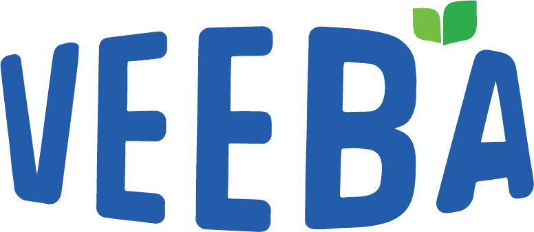
Throughout the process of adding features to the logo, I immersed myself in a hands-on approach, experimenting with various curves that would encapsulate Veeba's authenticity, fun, and innovative vibe. By meticulously crafting each curve, I aimed to create a visual language that resonated with the brand's core values and established a strong emotional connection with the audience.
Throughout the process of adding features to the logo, I immersed myself in a hands-on approach, experimenting with various curves that would encapsulate Veeba's authenticity, fun, and innovative vibe. By meticulously crafting each curve, I aimed to create a visual language that resonated with the brand's core values and established a strong emotional connection with the audience.

As I constructed the leaf, a crucial logo asset, I remained committed to upholding the same form language as the logo typeface. Ensuring visual harmony and coherence, Leaf is the most direct approach towards showing freshness which many use but through designing a leaf for never seen in any design before gives the brand a unique emblem to create a memorable difference.
As I constructed the leaf, a crucial logo asset, I remained committed to upholding the same form language as the logo typeface. Ensuring visual harmony and coherence, Leaf is the most direct approach towards showing freshness which many use but through designing a leaf for never seen in any design before gives the brand a unique emblem to create a memorable difference.
Old
Old

New
New
The Veeba Rebranding Project was a deep dive into aligning a brand’s visual identity with its core values and audience expectations. From analyzing user feedback to crafting a refreshed narrative, the process emphasized the importance of bridging perception gaps through thoughtful design. The outcome was a cohesive branding solution that redefined Veeba’s presence, ensuring it stood out while staying true to its essence.
The Veeba Rebranding Project was a deep dive into aligning a brand’s visual identity with its core values and audience expectations. From analyzing user feedback to crafting a refreshed narrative, the process emphasized the importance of bridging perception gaps through thoughtful design. The outcome was a cohesive branding solution that redefined Veeba’s presence, ensuring it stood out while staying true to its essence.
Scrolled this far?
let's make it worth
Singh.pallavi.des@gmail.com